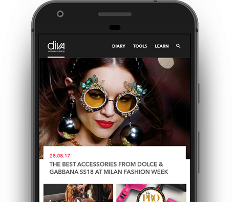
From here you can access expert opinions on hair trends, detailed information about the products as well as tutorials on how to use them to create both simple and complex styles.
Role: UX, UI, Art Direction.
Tools: Axure, Sketch, Photoshop, Illustrator.
Question
Diva Professional Styling is the leading professional hair electrical brand in the UK and Europe. They have an extensive range of excellent products, but consumers are often overwhelmed by the barrage of new trends and/or new product innovations on the market.
“How do we help users to understand product benefits in a way that both satisfies their specific needs, and allows them to engage more closely with the brand?”
Phase 1 : Defining Client Needs
I was approached with the task of producing an App for Diva Professional Styling, however,
whilst they knew they wanted an App and had lots of ideas about what they wanted to do,
they didn’t fully understand why they wanted to do it.
I guided them through several stages of trying to fully understand their goals and the
value proposition they were offering to their customers, both new and old.
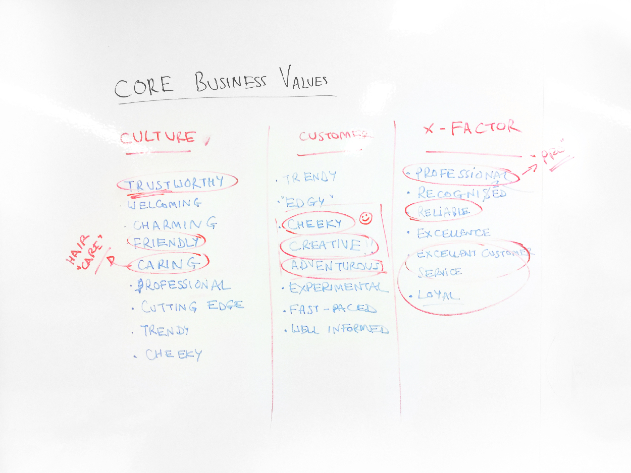
Understanding Business Values
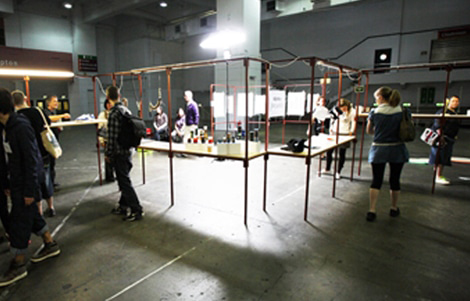
To start, we wanted to take the opportunity, with the client, to dive deeper into understanding the core business values of Diva Professional Styling so that it could be fresh in everyone’s mind as we conducted the next phase. To do this we conducted a simple workshop to tie together some of the key emotional values of the brand.
Phase 2 : Defining The User
User Interviews
The first step was to define potential users and the context in which they would want to use our
product.
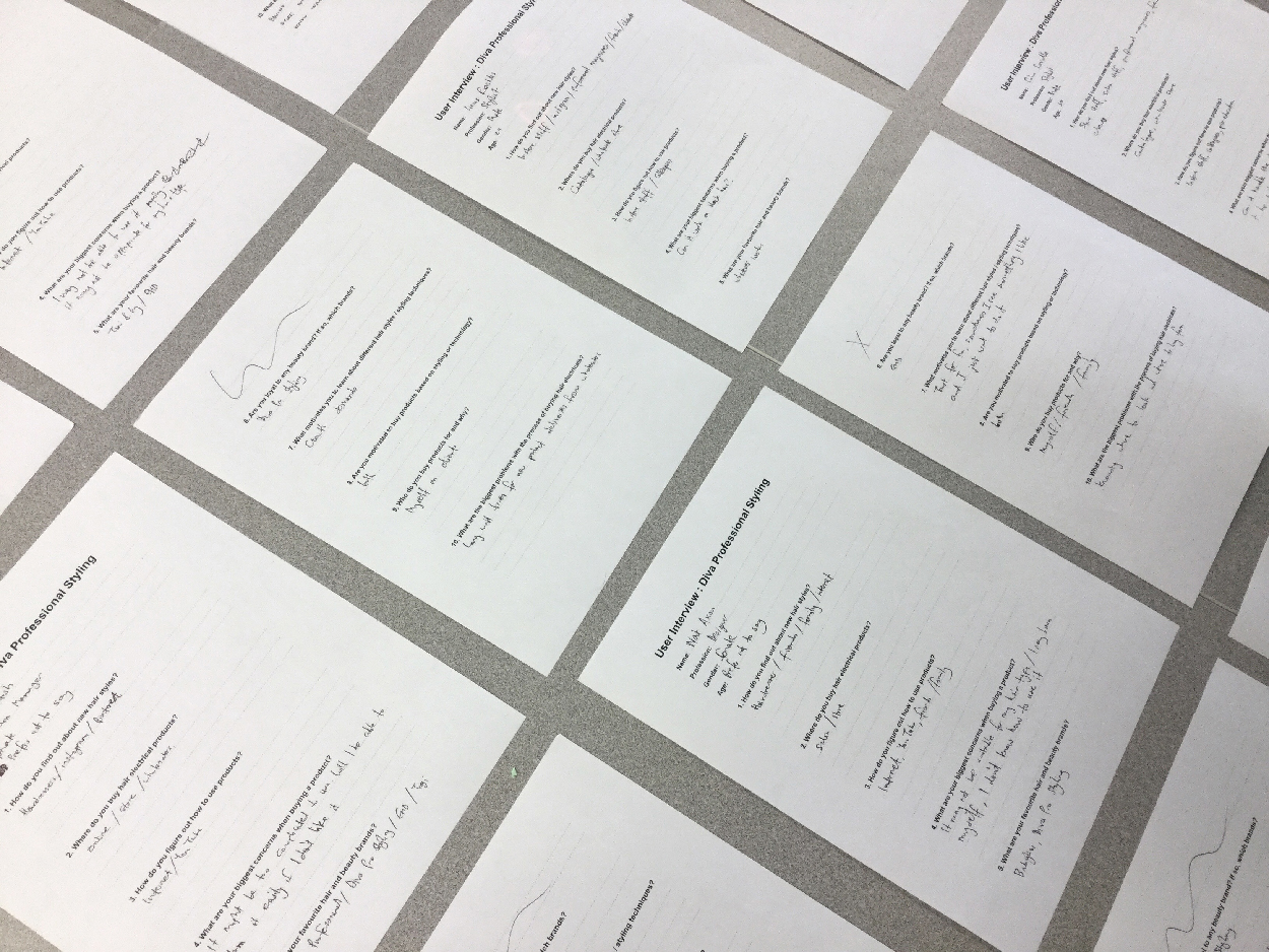
We interviewed what we saw as an optimal sample size of 7 customers, with 4 of the sample being current customers,
and 3 being people who had never used Diva Professional Styling products before.
We asked them 10 key questions, and recorded them, to build a better picture of our users and
their needs. These questions were designed to build a picture of the user in terms of why, how
and when they buy products, the touchpoints they interact with, as well as trying to gain
a deeper understanding of the competitor brands they use and why they use them.
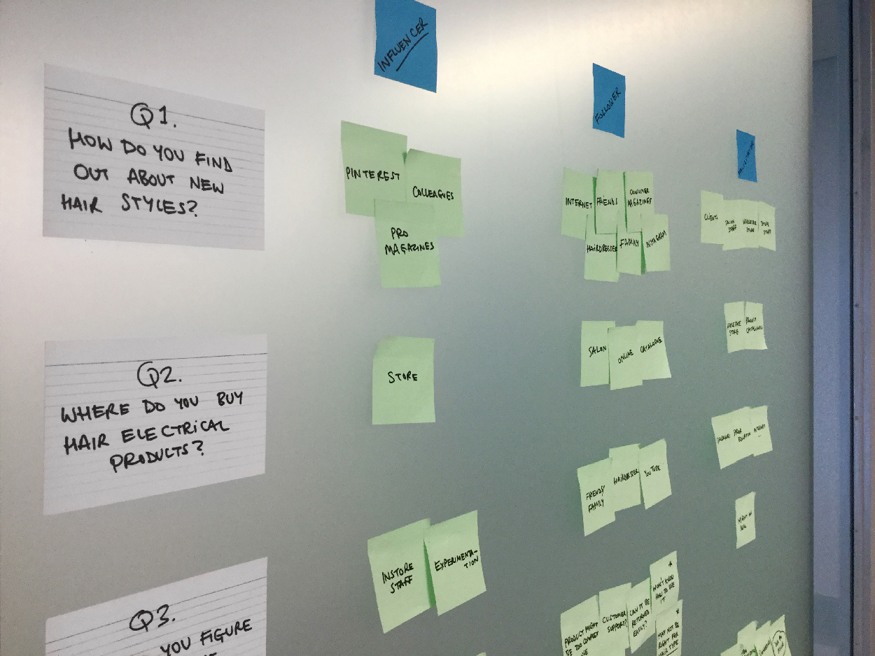
Affinity Mapping
These interviews proved to be incredibly insightful for validating and contradicting some our
original assumptions.
We took these interview findings and attempted to synthesize them into distinct user personas
by identifying patterns through creating an affinity map from their answers. This exercise involved, together with
the client, marking these interview responses on post-it notes, finding similarities in answers to form "clusters"
of post-it notes which visualised some of the behavioural patterns of the people we interviewed.
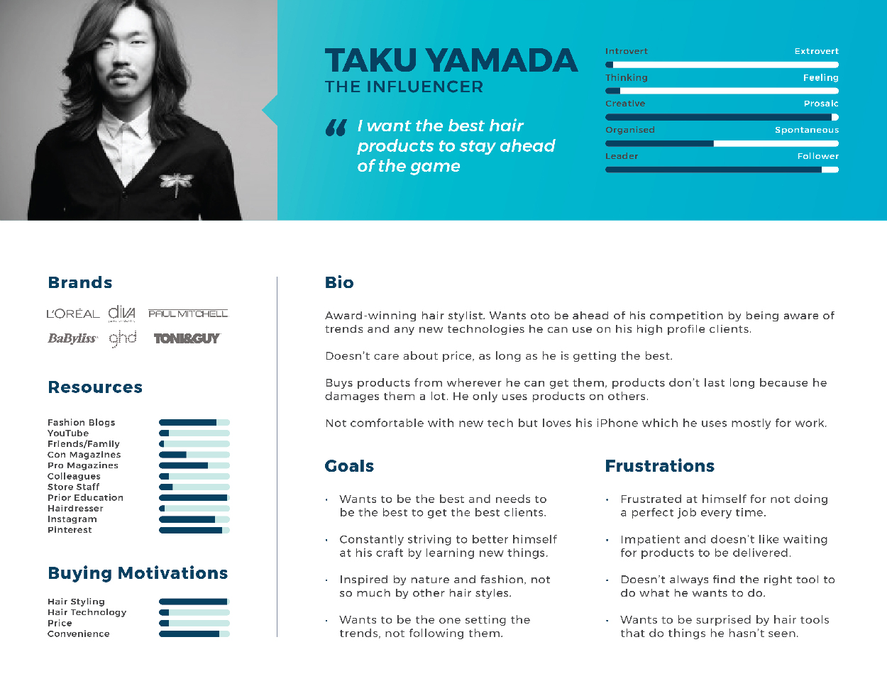
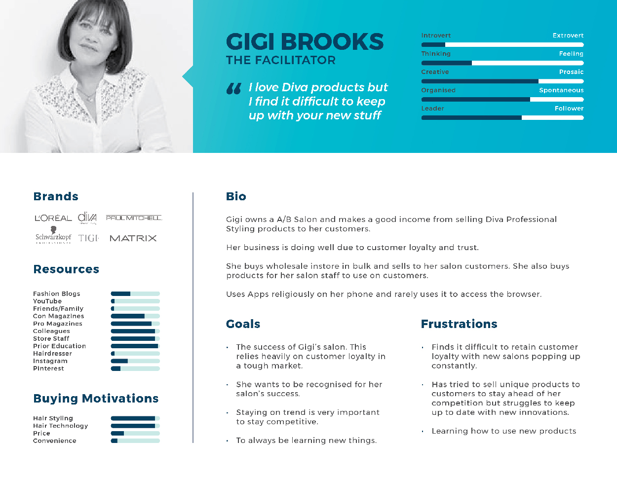
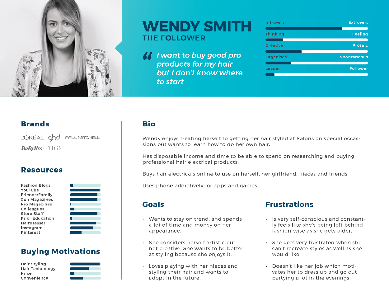
Personas
Taking our findings from the affinity mapping exercise and building on them, taking the interviewee's demographic
information and motivations into consideration, we formulated 3 distinct personas:
1. Influencer
2. Facilitator
3. Follower
Journey Mapping
We then further refined our User Personas by using information from the interviews to map their journey to buy a product. We wanted to sensitise ourselves to their feelings, pains and gains throughout this process, ultimately defining their NEEDS and finding OPPORTUNITIES for us to address them.
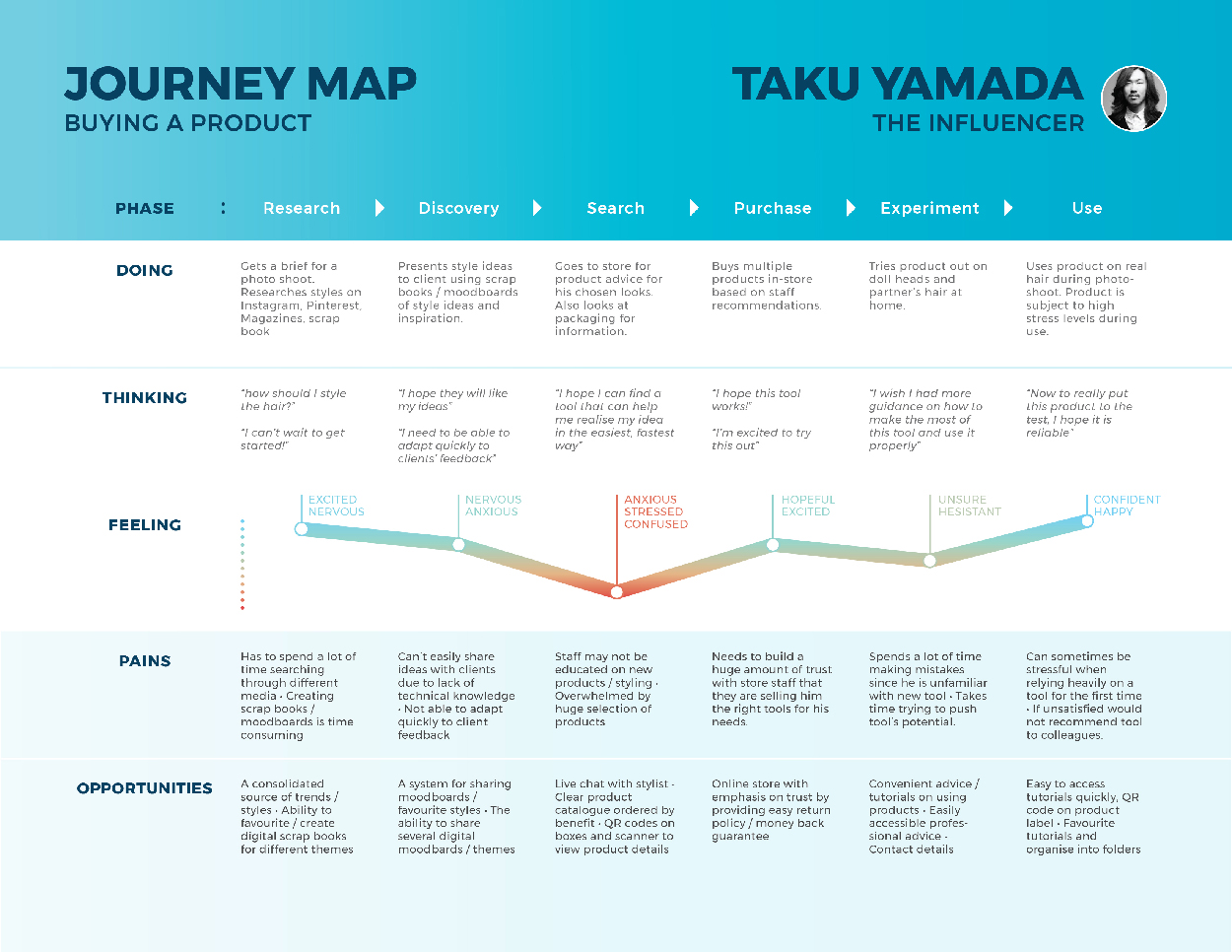
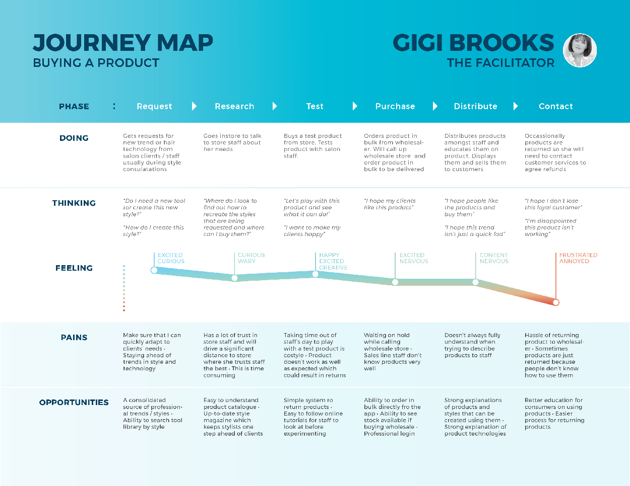
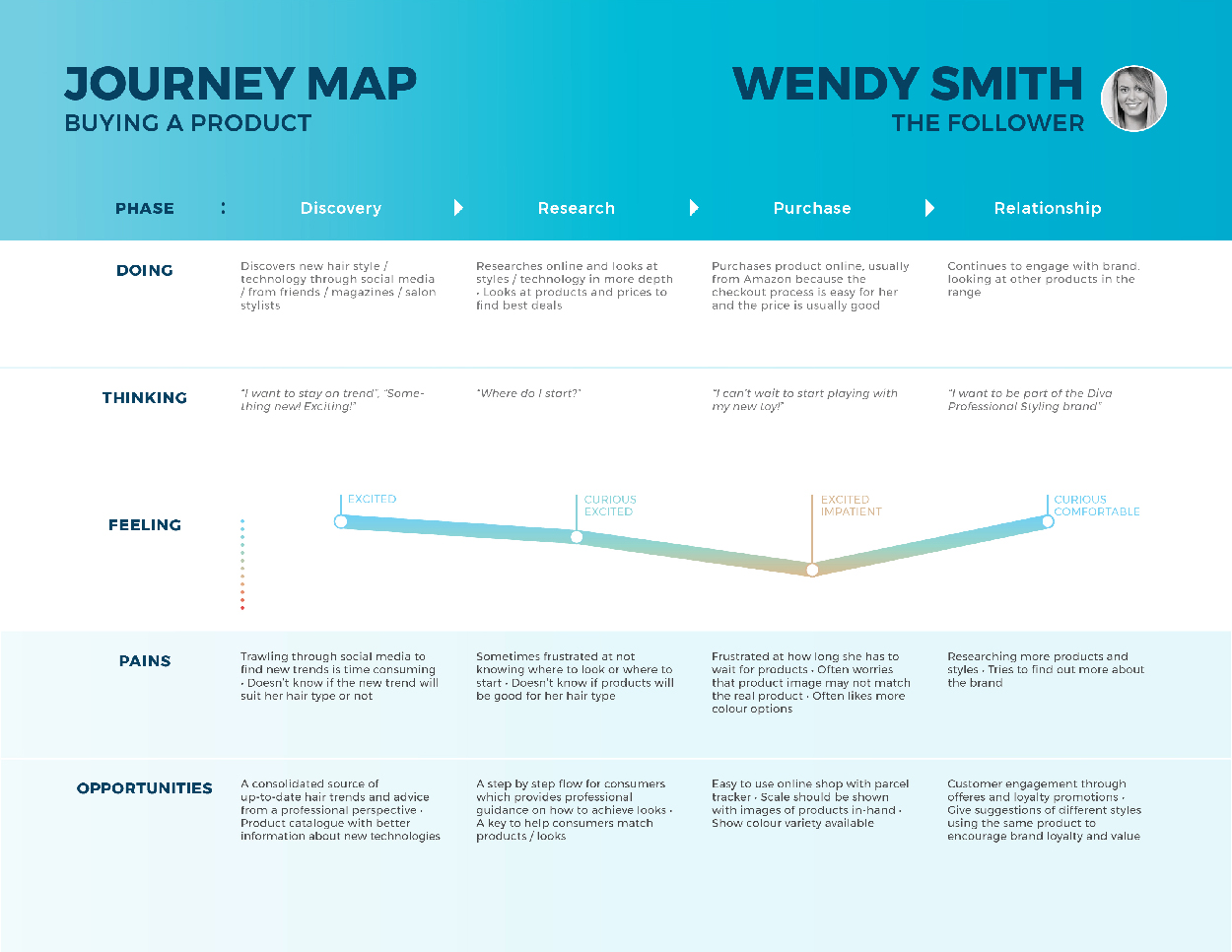
From these Journey Maps we were able to extract real OPPORTUNITIES in the form of potential product features that could very directly satisfy these users’ NEEDS.
Competitor Audit
Whilst the landscape in the Hair Electrical market is competitive, none of Diva Professional’s competitors have a mobile App. However, we broadened our competitor audit to other non-electrical hair and beauty brands with Apps based on the brands our interviewed users said they used.
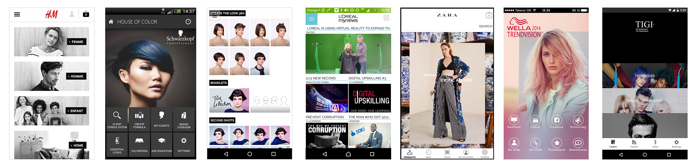
We went through these with the client and drew out some potential extra OPPORTUNITIES which we
added to the list.
• Make Your Own Hairstyle (Hair Photobooth)
• Store Locator
• Product Ratings
• Regular Interviews With Stylists
• Events / Meetups
• Archive Trends
This led us to a better understanding of what our users’ needs were, and how we can attempt to address
them by highlighting potential OPPORTUNITIES and turning these into practical features in an App or
something else.
Through the research and analysis outlined above, we concluded the following list of main OPPORTUNITIES:
• Hair Tutorials
• Hair Type Key For Products
• Professional Hair Trends (Articles / Blog / Guest Editor)
• Professional Hair Advice (Articles / Blog / Guest Editor)
• Blog With Archive
• Create A Scrapbook (Heart) Where You Can Favourite Looks And Tutorials
• Interviews With Experts (Articles)
• Store Locator
• Product Reviews
• Technology Descriptions
• Social Media Sharing
• QR Code Scanner
• Contact List For Customer Care
• Shop
• Account Login
• Events / Meetups For Training
• View Suggestions
With the client, we then took these possible solutions / OPPORTUNITIES and built a hierarchy of priorities
based on plotting them in terms of their value to the customer vs the feasibility of implementation.
The intention was then to build this diagram at every milestone to see if our priorities had changed and
if so, we could address them.
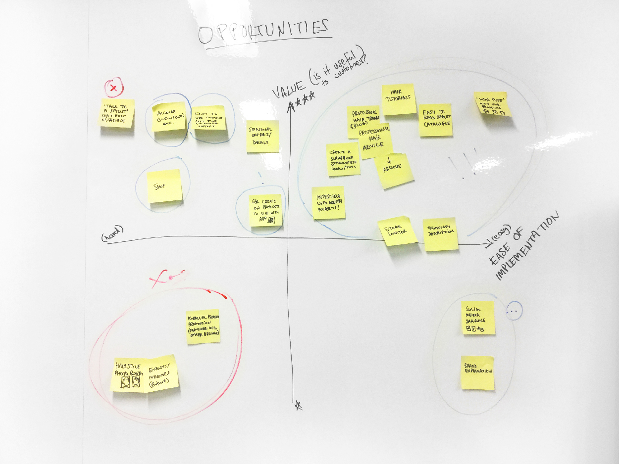
By using this tool, taking into consideration the frequency with which certain needs were communicated in the interview stage, we were able to divide these OPPORTUNITIES into our 3 main avenues which we discovered from our Journey Map.
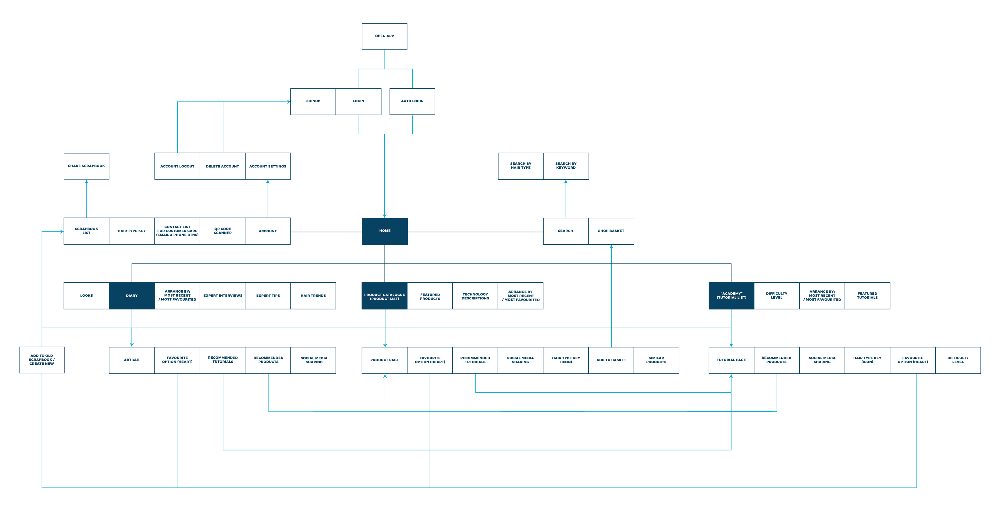
Phase 4 : Defining The Architecture
Task Flows
User stories can be distilled into related tasks. This helps to map out Task Flows with a better understanding of our Personas' requirements, based on what were the 3 most consistently important (highest in hierarchy) needs.
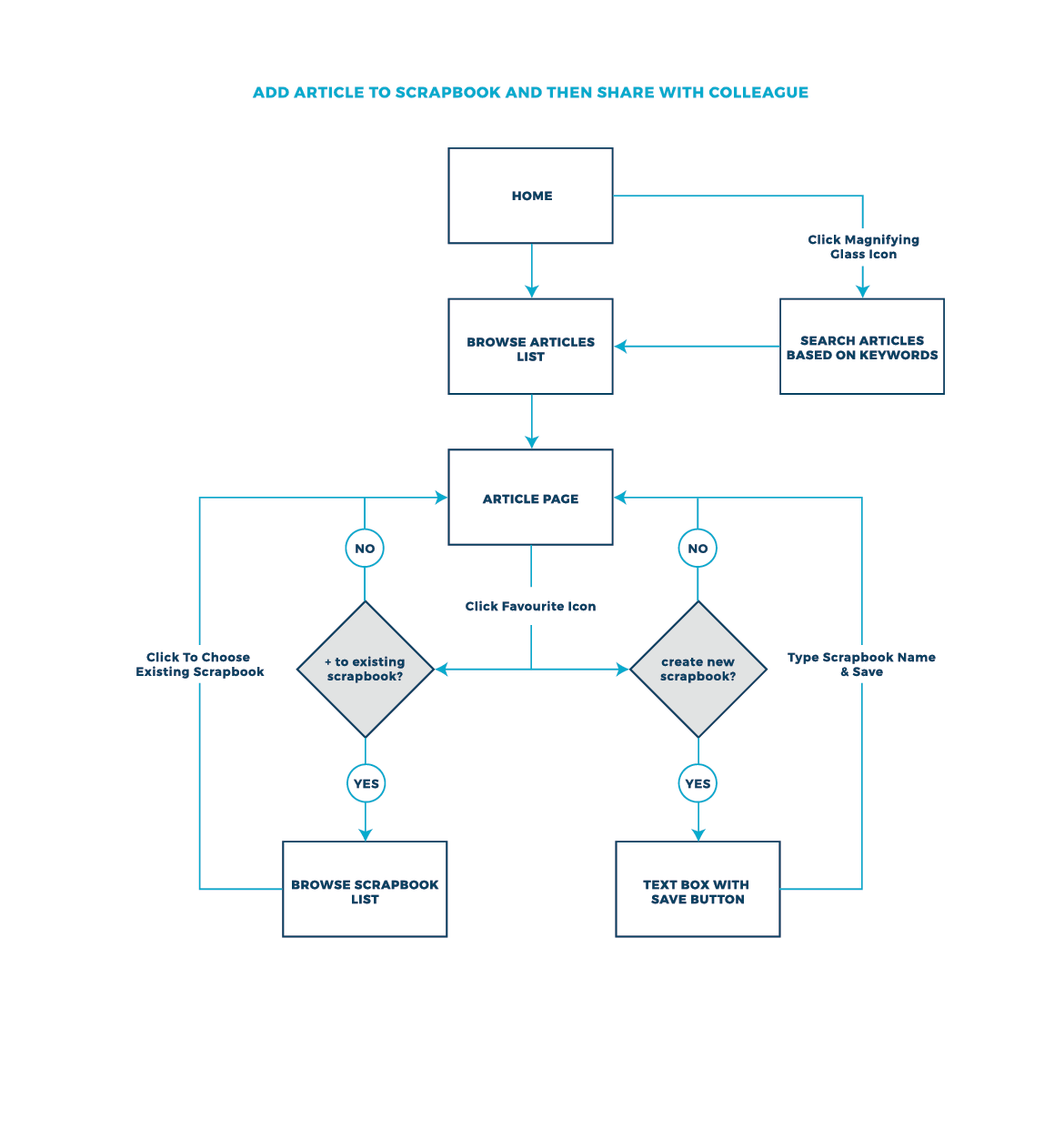
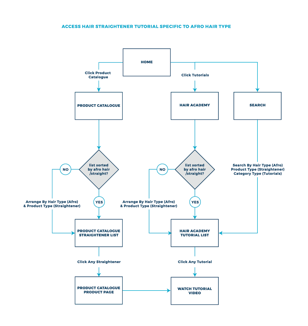
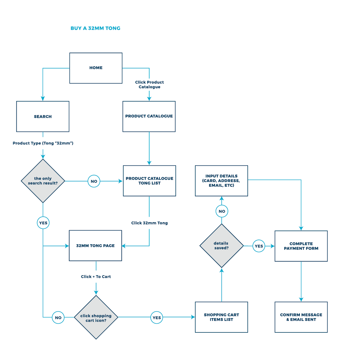
Site Map
We now had a clearer understanding of which direction to take after consolidating our user data.
From this we can derive a basic architecture for the App design, by essentially organising our heirarchy of the proposed App features (OPPORTUNITIES), and building task flows and/or user flows from running through the potential tasks to be undertaken when using these features.
Phase 4 : Defining the Look
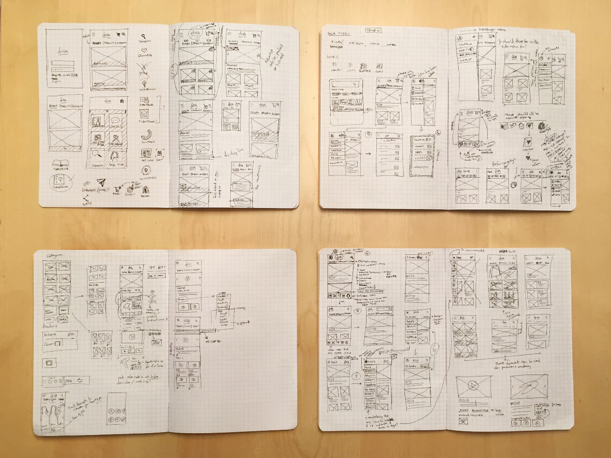
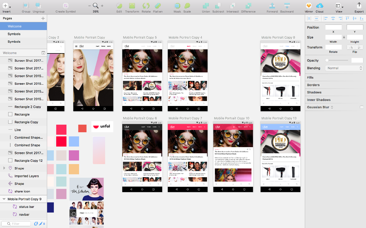
After refining the task flows and architecture with the client, I started to explore the visual design, ideating in low-fidelity using hand drawn sketches and wireframing in Axure, and then testing and iterating on the design in medium-fidelity using Sketch.
These rough hand-drawn sketches allow many ideas to start to take form and help to begin the process of seeing what works and what doesn’t.
Moving into Axure, I began to fine-tune some of these rough sketches and ideas into tangible interfaces in greyscale. I will then iterate on these ideas, problem solving as they take shape, apply design heuristics to focus on ensuring that the functionality and information hierarchy is clear and consistent.
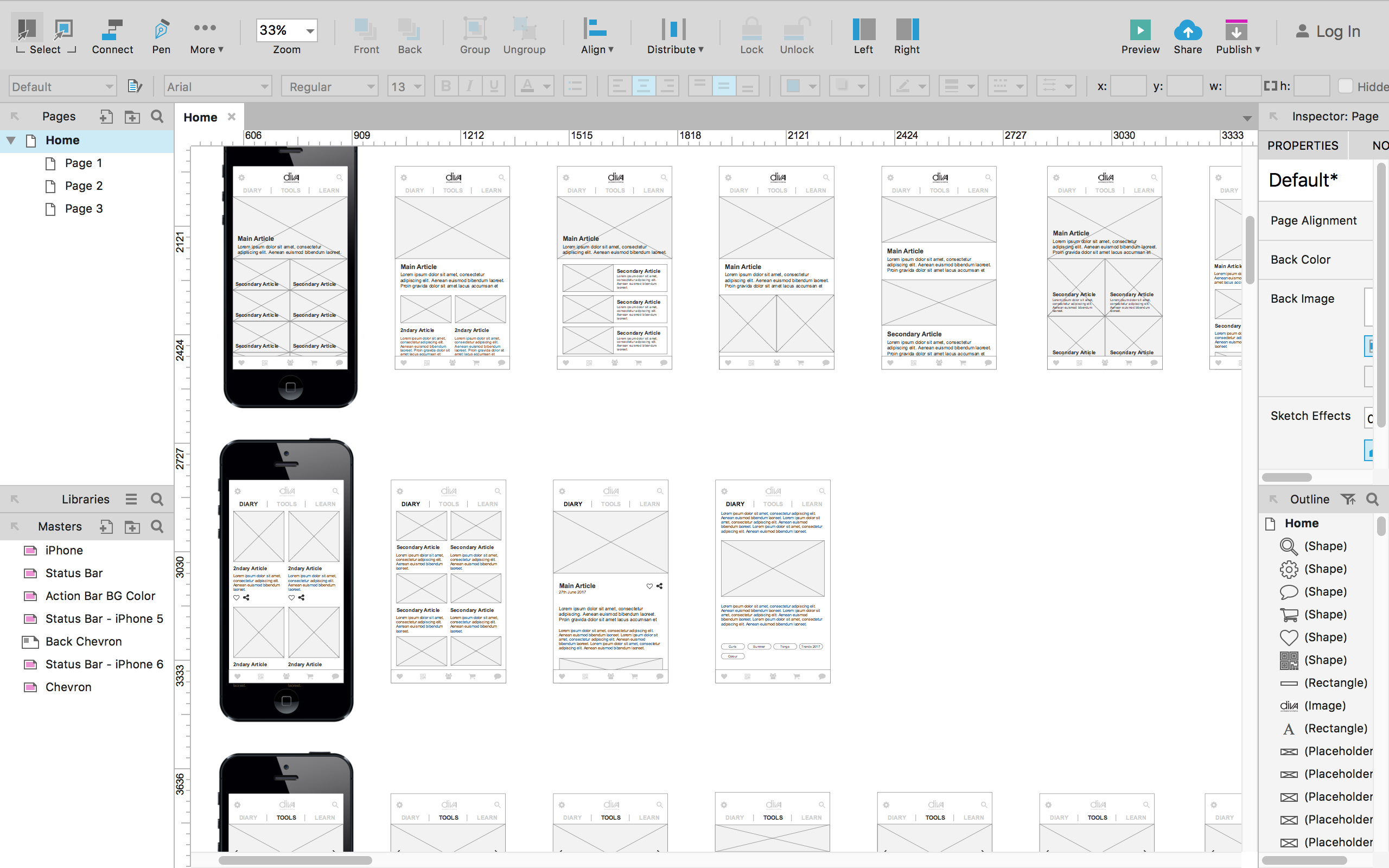
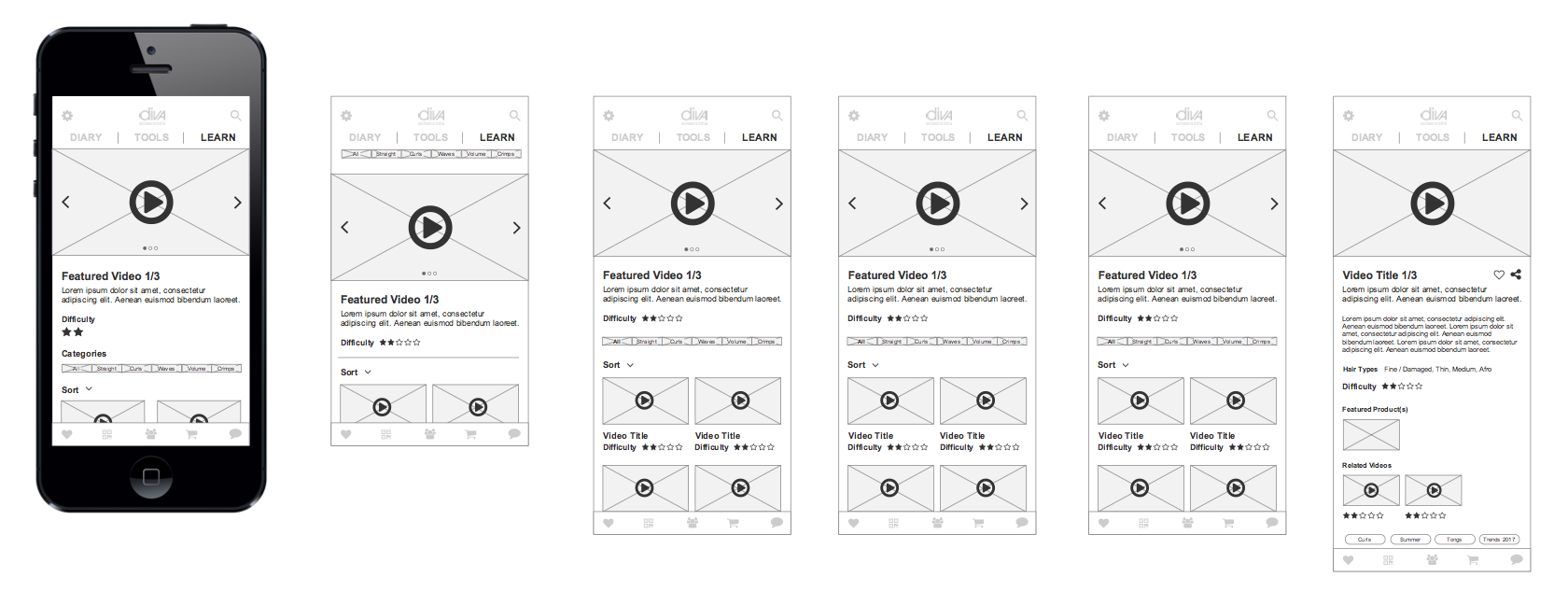
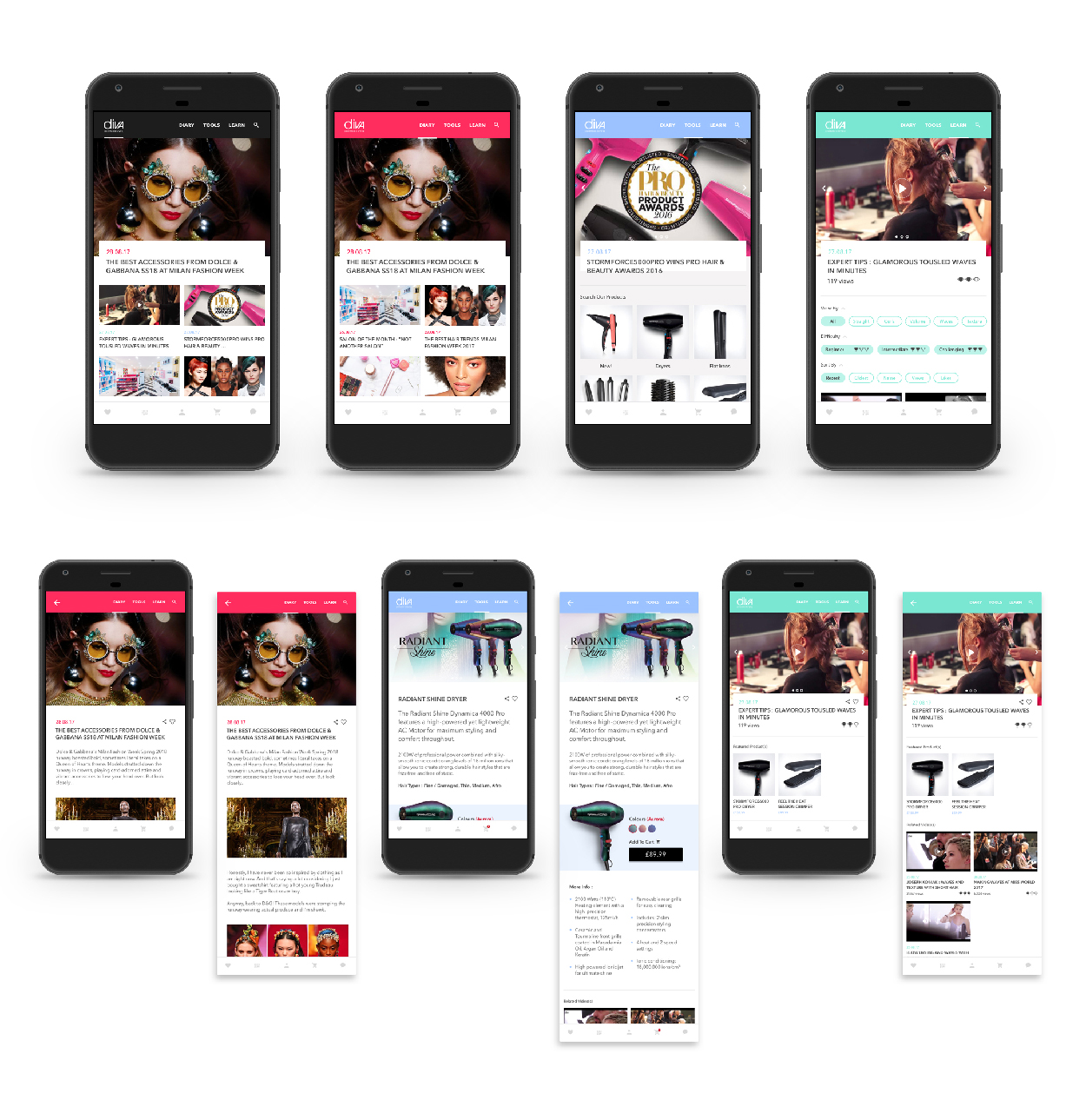
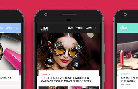
Continuing into Sketch we can start to apply more context, now bringing in colour, and making the design more tangible. My first step was to make sure that the app’s homepage was finalized as this sets the rules for how the user will interact with the application and its navigability.
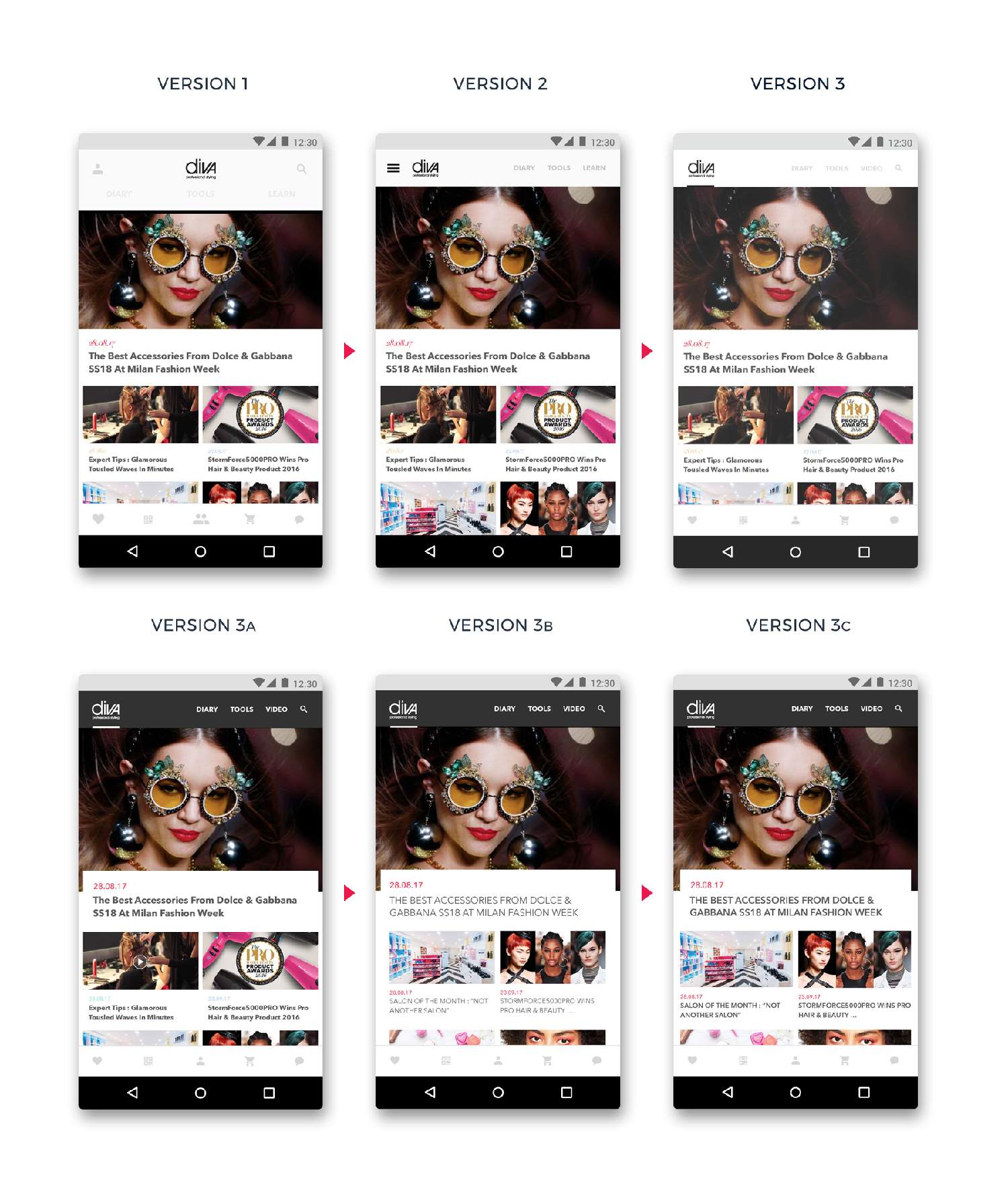
As the user is able to interact with a large amount of information, I presented the client with a couple of design ideas for how the menu system would work. The design was based on a system of 2 menus, one which allowed users to shift between 3 distinct “ecosystems” within the application: news, products and tutorials, and a second menu for secondary functionality.
We tested these ideas on some users and found that they preferred both menus to be visible at all times, whilst maximizing the screen space for content. Once the menu design concept was finalized, I continued to apply this logic to the rest of the pages, applying user/client feedback until a final design was realized.